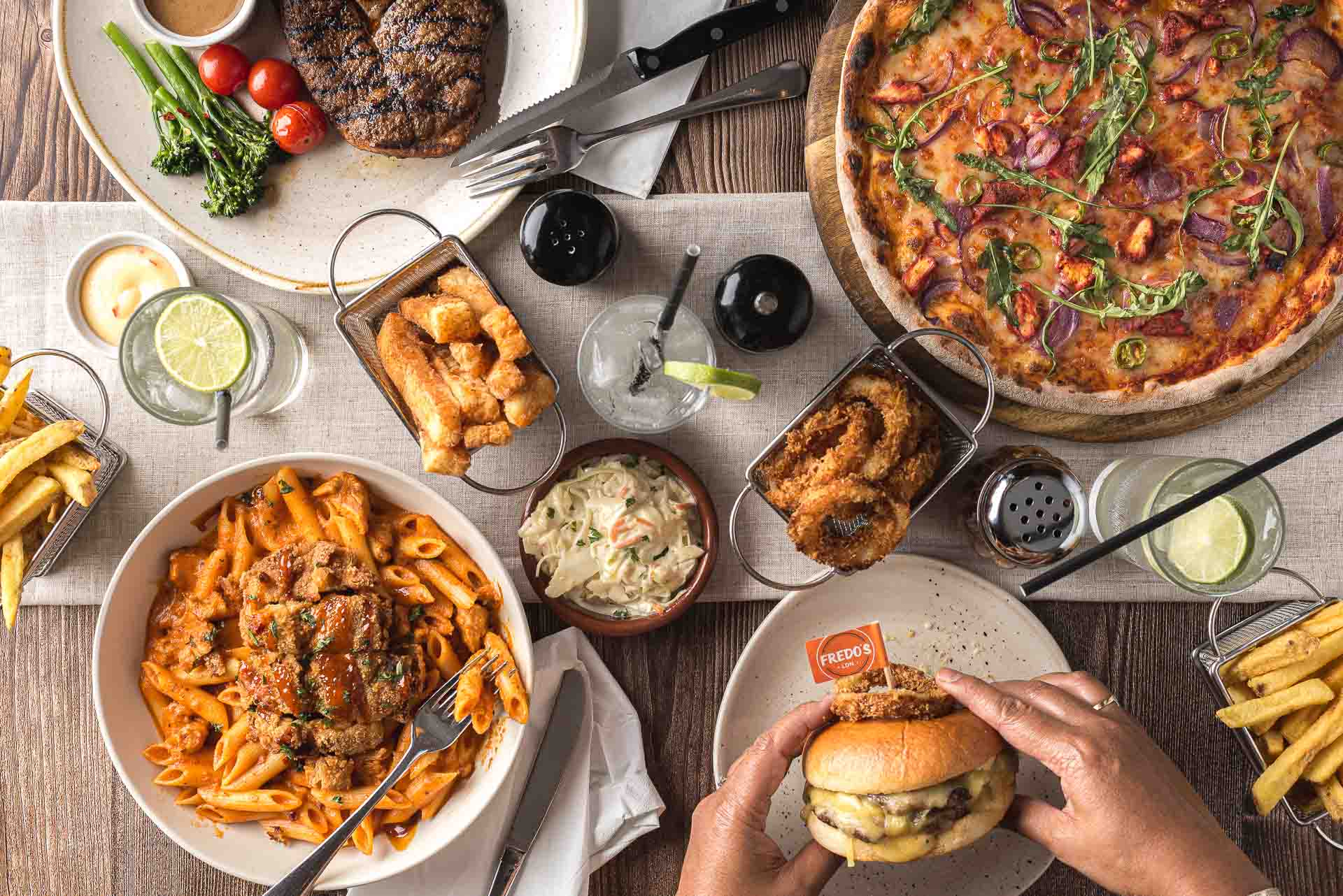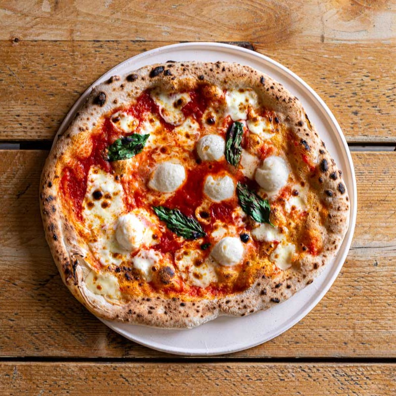
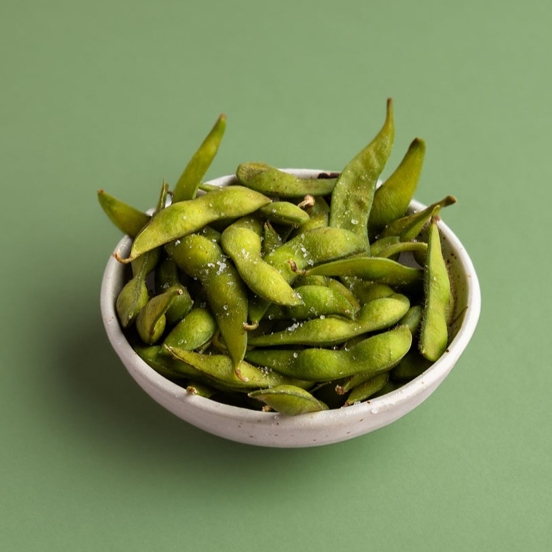
Photographing food for takeaway platforms is slightly different from shooting for restaurants, advertising or editorial work. The goal is not only to make the food look good, but to make it instantly clear to someone scrolling quickly on their phone.
Most people ordering on Deliveroo, Uber Eats or Just Eat decide in a matter of seconds. The image often comes before the menu description, which means the photography has a direct impact on clicks and orders.
Looking for professional menu photography for your restaurant? Find out about my takeaway food photography for Just Eat, Deliveroo and Uber Eats.
One of the most common mistakes restaurants make is trying to create images that are overly styled or too artistic. In reality, delivery platforms tend to work better with clean and honest photography.
Customers want to recognise the dish immediately and understand what they are ordering without distractions. In most cases, simple presentation works far better than complicated styling.
Effective 9 October 2026
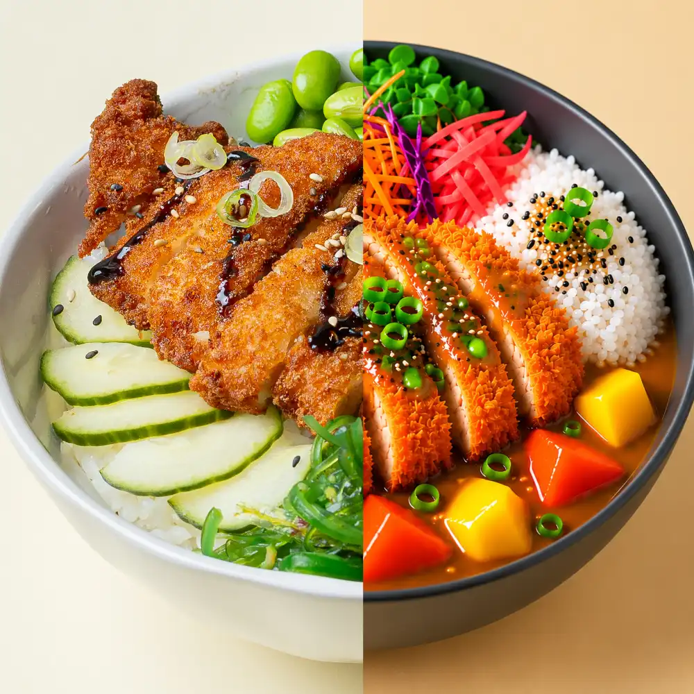
Menu photographs should show the actual dishes as they are prepared and served to customers. I do not use generative AI to create or replace food, ingredients, portions or other details in menu photography.
Standard photographic editing, such as colour correction, exposure adjustment and cropping, is fine as long as it does not misrepresent the dish.
Platform rules differ. Deliveroo explicitly does not permit AI-generated images. Uber Eats and Just Eat also require menu photos to accurately represent the food being sold.
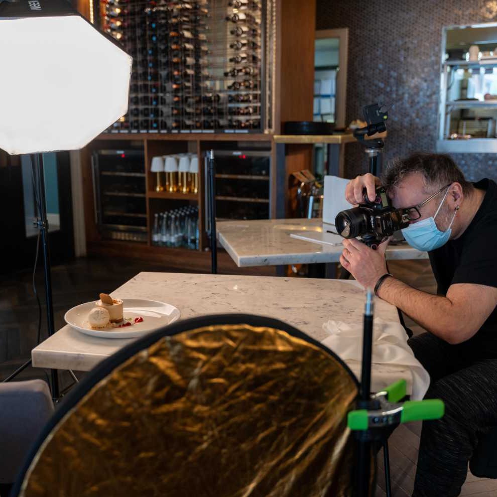
Lighting also plays a huge role. Harsh shadows, warm indoor lights or dark images usually perform poorly, especially on mobile screens.
In most cases I try to keep the light natural and soft, while still giving texture and depth to the food. Burgers, pizzas, noodles and fried food all react differently to light, so the approach changes slightly depending on the menu.
Another important aspect is framing. Platforms like Deliveroo often crop images automatically into square formats, so dishes need enough breathing space around them.
If the composition is too tight, parts of the plate may disappear once uploaded to the app. It sounds like a small detail, but it can make a big difference in how professional the menu looks overall.
Uber Eats is usually stricter with image requirements. They generally prefer one dish per image and very little distraction in the frame.
Just Eat tends to be a bit more flexible, although the same principles still apply. Clear presentation almost always works better than complicated styling.
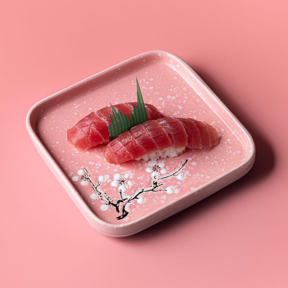
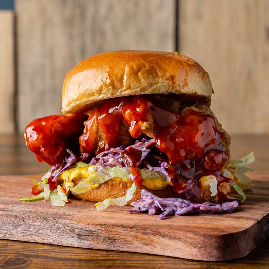
I also often recommend creating a strong hero image alongside the individual dishes. This is usually the first image customers see while browsing, so it should give a quick feeling of the restaurant as a whole rather than focusing on a single plate.
See how I photographed more than 130 menu items and two hero images for Nami Sushi Bar in Tooting, London.
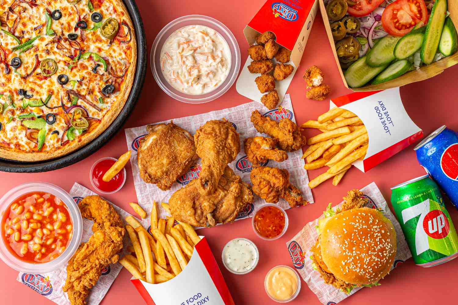
A good takeaway photo should feel fresh, clean and believable. The food still needs personality, but the main priority is helping the customer make a quick decision with confidence.
Across Deliveroo, Uber Eats and Just Eat, the structure is very similar:
Menu item images
- One single dish per image
- Dish centred and clearly visible
- Ingredients easy to recognise
- No distractions
These are the images that drive most orders.
Platforms require clarity and accuracy, the photo must match exactly what the customer receives.
Hero / cover images
- Multiple dishes (usually 4–6 items)
- Represents your brand and menu variety
- Clean composition, not overcrowded
This is your “first impression” image when customers browse.
Keep it simple
- Clean background
- No clutter
- Focus only on the food
Centre the dish
- Always place the dish in the middle
- Leave space around it for platform cropping
Poor framing can lead to rejection or bad cropping in-app.
Show the food clearly
- Use angles that reveal ingredients (top-down or 45° works best)
- Cut items like burgers or wraps to show inside
This helps customers understand what they’re ordering.
Lighting
- Natural light is always best
- Avoid harsh shadows or yellow lighting
- Keep colours realistic
Bad lighting is one of the main reasons images get rejected.
These are common rejection reasons across all platforms:
- No people or faces
- No text, logos, or watermarks
- No heavy editing or unrealistic colours
- No multiple dishes in menu item shots
- No messy or dirty environments
Platforms prioritise authenticity and clarity over “creative” styling.
Each delivery platform has its own image sizes, formats and cropping rules. We prepare images with enough space around the subject to allow for these crops, then tailor the final files to the platform you use. Requirements can change, so please check the platform’s upload guidance before submitting.
Shared guidance
- Show each dish clearly and accurately.
- Keep the main subject centred, with space around it for cropping.
- Use a clean, well-lit image with no text or graphics unless the platform allows them.
Deliveroo
- Menu items: landscape image, minimum 1200 × 675 px; JPEG, maximum 8 MB. Deliveroo may crop it to a square, so leave room around the dish.
- Hero image: landscape, minimum 1920 × 1080 px, featuring at least five dishes. Keep key details near the centre to allow for different crops.
Uber Eats
- Menu items: show one menu item clearly and centre it. Recommended aspect ratio is 5:4 to 6:4; JPG, PNG or GIF, up to 10 MB.
- Cover image: use the separate cover-image requirements in Uber Eats’ guidance.
Just Eat
- Dish images: 1024 × 768 px, landscape 4:3; JPG or PNG, 1–10 MB.
- Menu header: 2400 × 1600 px, landscape 3:2; JPG or PNG, 1–10 MB; ideally show three or more dishes.
Platform requirements last checked: October 2026
Deliveroo
- Strong focus on clean composition
- Requires space for square crop
- Hero image plays a big role in visibility
Uber Eats
Strict on:
- One dish per image
- No text or branding
- No poor lighting
Just Eat
- Less publicly documented
- Clear dish presentation
- No clutter
- Accurate representation
In practice, consistency across all platforms is key.
You can take photos yourself, but most restaurants struggle with:
- Lighting consistency
- Styling
- Correct framing for cropping
- Maintaining brand identity across platforms
Professional photography ensures:
- Higher conversion rates
- Stronger brand perception
- Better performance in search results
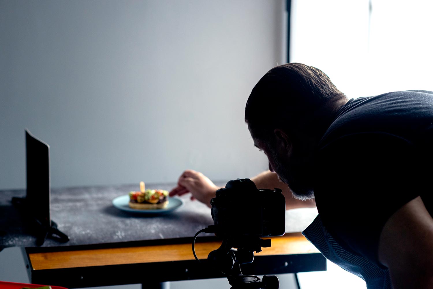
In most cases, simpler works better. Customers ordering online want to recognise the dish immediately without too many distractions. Clean lighting, realistic colours and clear presentation usually perform better than heavily styled images.
Yes, although the overall direction is similar. Deliveroo tends to focus quite a lot on image composition and cropping, while Uber Eats is usually stricter about keeping one dish per image. Just Eat is generally more flexible, but good consistency across the whole menu still makes a big difference.
Social media and delivery platforms have completely different purposes. Instagram photography can be more creative and atmospheric, while takeaway platforms need clarity first. Images have to work quickly on small mobile screens where people are making fast decisions.
It depends on the dish. Top-down works very well for pizzas, bowls and flat dishes, while burgers or layered food often look better at a slight angle. The important thing is making the ingredients easy to see straight away.
They can, and sometimes modern phones produce decent results, especially in good natural light. The challenge is usually consistency. Menus often end up looking uneven, with different lighting and colours from one dish to another. Professional photography helps create a cleaner and more reliable look across the whole menu.
That depends on the size of the menu, but usually the best approach is focusing on the strongest sellers first. Hero dishes, signature items and visually appealing plates tend to have the biggest impact on customer decisions.
Common reasons include poor lighting, images that are too dark, multiple dishes shown as a single menu item, heavy editing or photos that do not match the actual dish customers receive. Cropping issues can also cause problems on some platforms.
For many restaurants, yes. Menu images are often the first thing customers see before reading reviews or descriptions. Strong photography can improve the overall perception of the brand and help menus feel more premium and trustworthy.



Professional photography and video for food, interiors, architecture and brands. Tell Alessandro what you need and he’ll help you plan the right shoot for your project.